2020 rings in a new decade with new neutrals for home interiors. Trending color palettes are aimed at creating a sense of calm, comfort, and connection with nature.
Over the last decade, grays and whites have dominated wall colors in the home. “Beige went out as a neutral in the early 2000s,” notes Orlando Custom Home Builder Jorge Ulibarri.
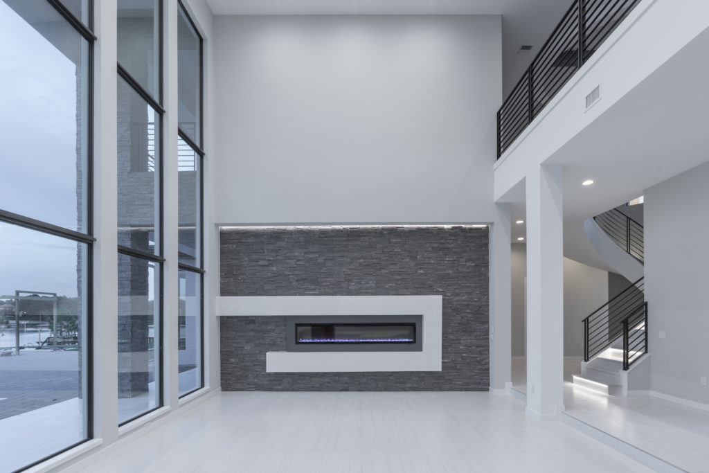
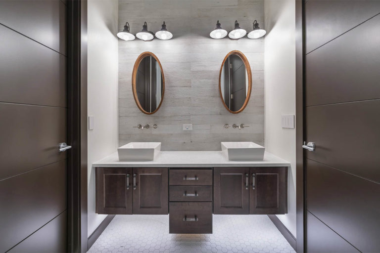
“In many of the modern houses that I design and build, the clients either pick a gray or a white color palette and offset its trendiness with a dark, espresso color for the doors and trim along with wood floors to ground the living space, keeping it timeless,” Jorge says.
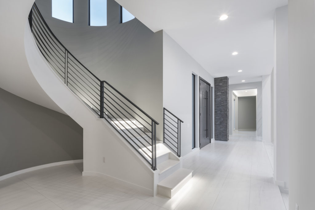
Jorge recommends painting a few accent walls in gray rather than an all-gray color palette for the home. “Accent walls can be updated easily in the future.”
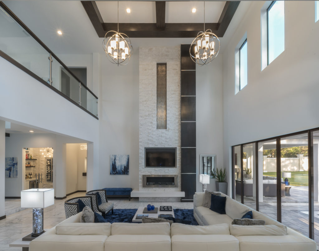
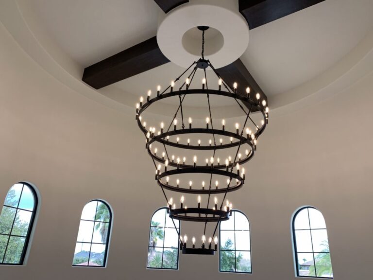
Brown painted trim and doors are another affordable upgrade and alternative to a wood stained finish. “We can paint the doors and the trim with a dark espresso color that looks almost identical to the wood stained look of a dark walnut finish. When the client goes with painted beams, we can tie in the wood doors and trim to match back to the beams and wood accents,” Jorge notes. The same holds true for gray painted trim and doors. “The wood beams can be done in a gray color scheme and all the wood accents including the wood floors can match back.”
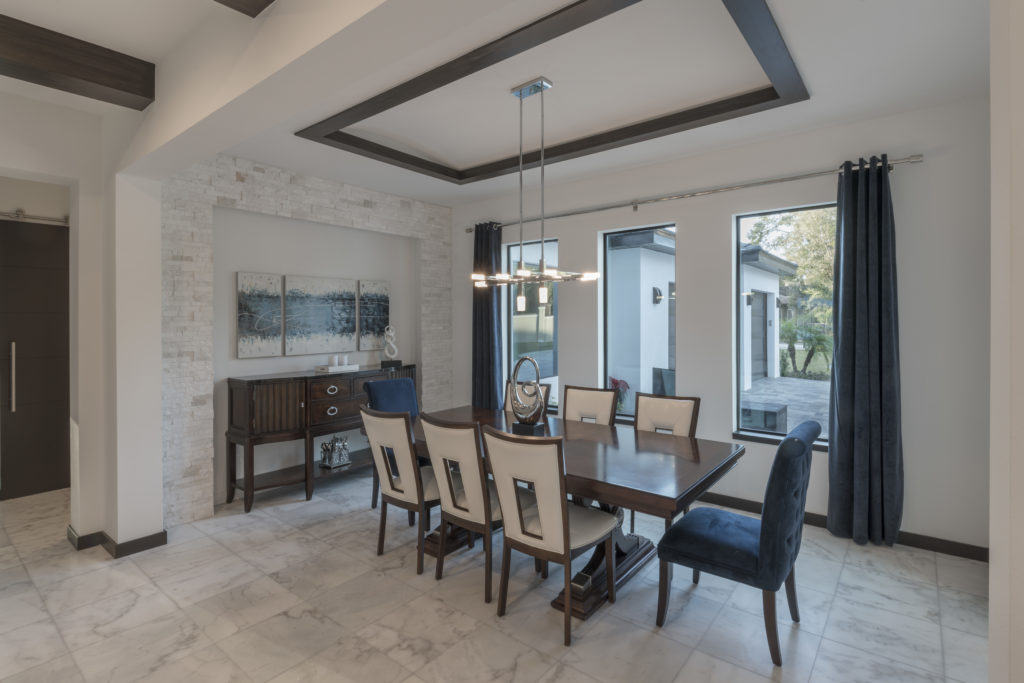
The Orlando custom builder notes that choosing the right white as a neutral can be challenging. “Whites are rarely pure; they tend to have shades of color to them. A white paint color could have a blue, pink, gray or yellow tint that comes out in certain lighting conditions. I encourage homeowners to paint several samples of their chosen color throughout the house under different lighting scenarios,” Jorge says. He prefers using Pure White by Sherwin-Williams because it tends to have the least coloring in it.
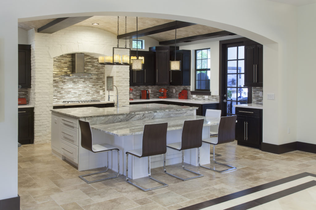
Each year, major paint companies release their picks for Color of the Year. Choices vary widely for the 2020 Color of the Year so we’ve distilled the paint company picks down to a list of new neutrals for 2020. Here’s what you need to know:
Blue Hues:
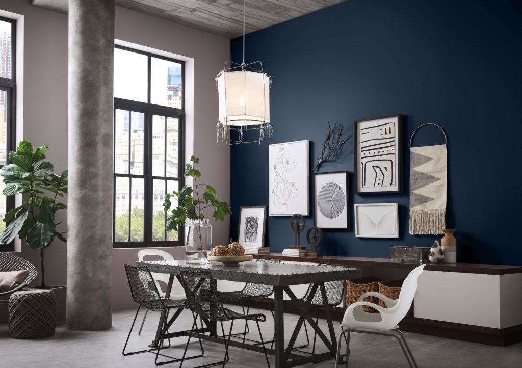
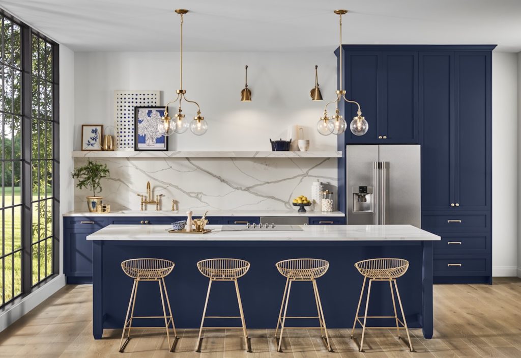
Sherwin-Williams announced Naval SW 6244 as its 2020 Color of the Year. The paint company describes it as a rich navy hue with a deep, sapphire-like quality.
“The use of color in interior design is changing,” said Sue Wadden, director of color marketing at Sherwin-Williams. “It’s not just about what a space looks like anymore, but how it makes you feel. People want to feel grounded and inspired to pursue their mental, physical and emotional well-being. Naval is reminiscent of the night sky, which people have looked to for centuries for guidance, as a muse and as a reminder to live more mindfully.”
Wadden notes that the last decade saw color evolve from beiges to cool grays and now back to warmer neutrals. “While greens and blues are always popular, how we’re using them in design is changing. In the coming decade, key combinations will include black, white and navy for a timeless look, or navy and jewel tones for a nod to Art Deco,” Wadden says.
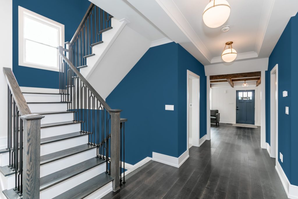
PPG paint brand picks Chinese Porcelain (PPG1160-6) a blend of cobalt and ink blue as an easy transition from yesterday’s neutrals to richer yet restful colors. “PPG’s Chinese Porcelain delivers the energy and brightness of cobalt blue and incorporates the enveloping of a deep, muted navy tone. The need for simplicity and escapism from technology is in part, the reason that consumers are craving blues like Chinese Porcelain that bring us closer to natural elements such as the sea and sky – the horizon spot, creating serenity in any space,” explains Dee Schlotter, senior color manager, PPG paint brand
Earth Tones:
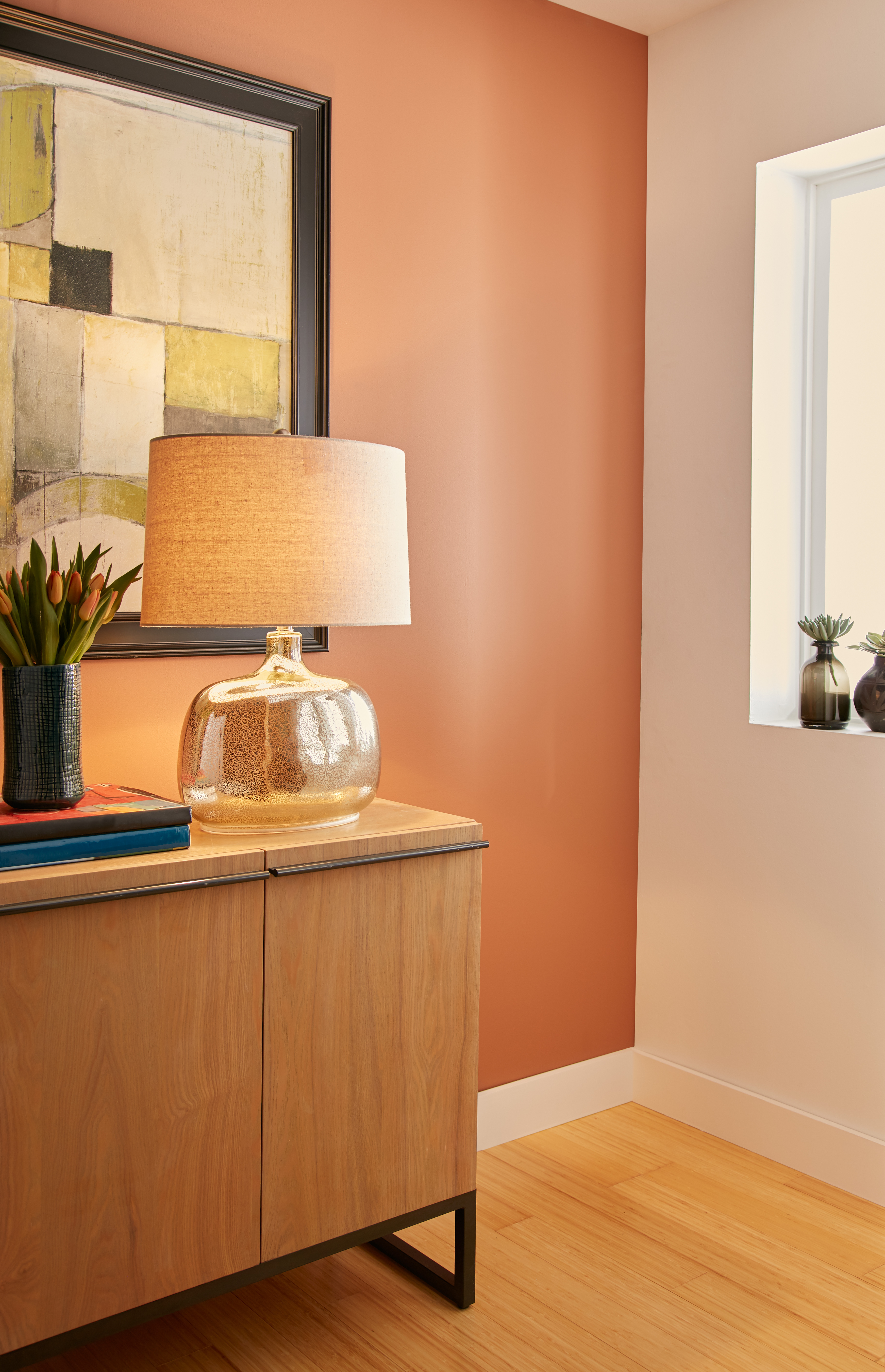
Color experts and interior designers predict warm, earthy tones will be the neutral alternatives to the muted grays, ubiquitous since the economic downturn of 2008. Envision clay, copper, terra cotta, chocolate browns and soft yellows. Behr paints released its 2020 color forecast with 15 colors that embrace exploration and natural environments. The colors draw inspiration from natural elements such as sky, earth, water and plant life.
Natural Greens:
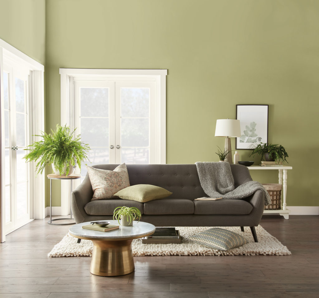
Driven by a desire to connect with nature and the outdoors, greens found foliage and plants are trending in 2020. Popular hues within this shade include green tea, malachite and verdant greens, colors of the forest. Behr paint picked the biophilic shade Back To Nature S340-4: a restorative, meadow-inspired green. Behr believes its 2020 Color of the Year can purify and promote a balanced space—bringing the outside, inside. “As we look ahead to a new decade, Back To Nature encourages us to reengage with the natural world, which we know can have a real, positive impact on our well-being,” says Erika Woelfel, vice president of color and creative services at Behr. The paint company sees this slightly yellow-based green as a new neutral that adds peace and tranquility to any space.
Soft Pastels:
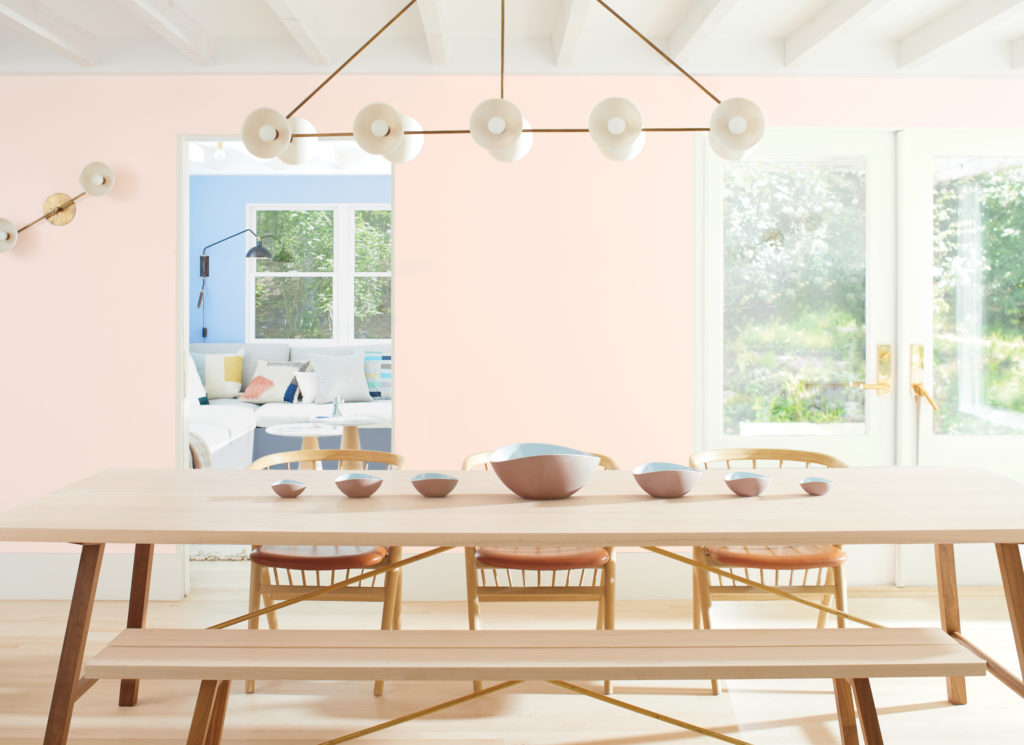
Benjamin Moore chose a rosy pink named First Light 2102-70 as its Color of the Year to represent a new dawn of idealism, design and living. “First Light 2102-70 reflects a new definition of the home – a shift in mindset from the material to satisfying the core needs in life: community, comfort, security, self-expression, authenticity and ultimately, optimism,” says Andrea Magno, Benjamin Moore Director of Color Marketing and Development. First Light is one of ten hues in the Benjamin Moore Color Trends 2020 palette that delivers modern paint color pairings that combine optimism with understatement, a timeless way to lighten up. “Color is powerful but highly subjective, especially through the lens of different generations, relationships and moods. But from the saturated to bright and airy, all are easy to live with and easy to love–whether they stand alone, in a strong pair, or all cohabitate,” says Magno.
Home decor brand Essential Home sees Neo Mint as the top color for 2020 in home decor, describing it as a fresh tone of green with a cool, futuristic feel.
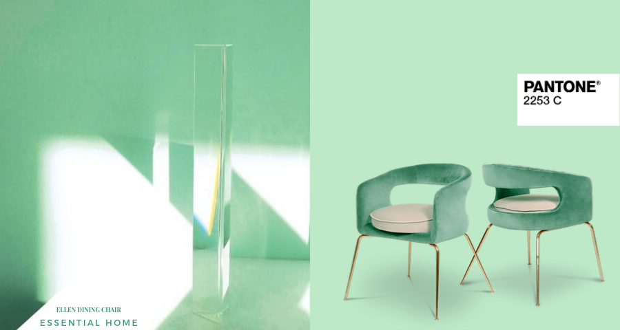
As the home becomes a place of peace and refuge that promotes wellness and self-care, expect to see the latest color trends such as regenerative greens and grounding earth tones color living spaces of all styles.

