Opposites Attract as Color Makes a Comeback in Home Decor for 2013
Color is making a huge comeback in home décor and design. Beige walls are out of fashion along with the idea of flipping homes for a quick buck. As more homeowners opt to stay put in their homes for the long haul, they are trading in neutrals for statement hues that bear their own unique décor signature.
Sherwin-Williams has pegged the Color Trends for 2013 and packaged them in four distinct palettes. Recently, while attending the International Builders’ Show in Vegas, I spoke with Sue Wadden, Color Consultant and Interior Designer for Sherwin-Williams. “The 2013 Color forecast is called Opposites Attract. We featured four collections ranging from deep, dark, saturated masculine tones, all the way to bright, energetic, exciting colors with punches of gray, black and white as palette cleansers, “ explains Wadden.
Every year, Sherwin-Williams culls their color forecast from what’s trending in fashion, pop culture, consumerism and the arts. The reigning color for 2013 is Aloe, as anointed by Sherwin-Williams.
-
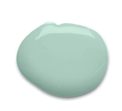
Aloe SW6464 Color of the Year 2013 as deemed by Sherwin-Williams
“This is no ordinary pastel – Aloe is funky and glamorous, demure and free-spirited. While Aloe’s vibe can verge on retro, when paired with caviar blacks, crisp whites or soft grays, suddenly Aloe has a new soul and attitude. And Aloe is highly adaptable, making it a perfect pick for everyday spaces such as a breezy sunroom or a well-dressed living room,” says Jackie Jordan, Sherwin–Williams director of color marketing.
-
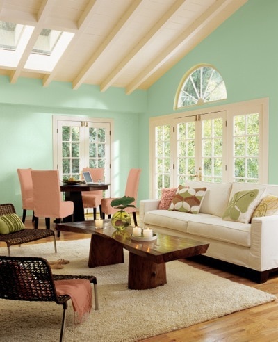
Aloe SW6464 Color of the Year 2013 as deemed by Sherwin-Williams
Here is a breakdown of the Four Color Palettes in 2013’s Color Forecast:
Midnight Mystery:
-
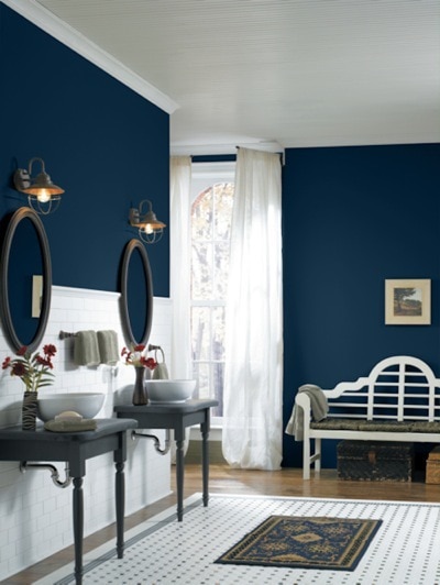
Midnight Mystery Palette in Loyal Blue (SW 6510)
This color palette features oxidized, metallic hues. “Midnight Mystery connotes a moodiness inspired by the futuristic Victorian vibe of steampunk design. It’s a turn of the century aesthetic, a mixture of Thomas Edison and visible mechanics,” explains Wadden. The palette has dark, earthy colors counterbalanced with green grays.
Honed Vitality:
-
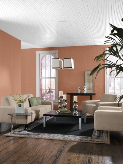
Honed Vitality Palette in Spiced Cider (SW 7702)
These earthy, desert inspired colors kick up the neutral palette a few notches with pops of blue for sky and water. The palette draws inspiration from the layered hues of mineral deposits, sea-buffed stones and the weathered shutters of a rustic farmhouse. “It’s very grounded to the earth and very useable for interior and exterior residential and commercial,” says Wadden.
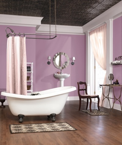
Vintage Moxie:
-
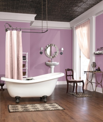
Vintage Moxie Palette in Radiant Lilac (SW 0074)
This collection of 60s inspired pastels has a retro glamour of pearls, florals and classic feminine silhouettes tempered by funky accents and attitude, according to Sherwin-Williams. Wadden calls them “pastels on speed.” She suggests using these colors as interior pops set off by a white canvas.
High Voltage:
-
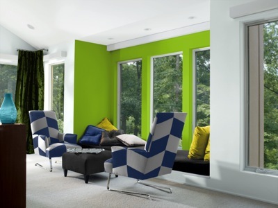
High Voltage Palette in Electric Lime(SW 6921) and Extra White (SW 7006)
These bright colors mirror the neon lights of Vegas and 80s fashions. The High Voltage collection has an electric feel and works well with palette cleansers such as black, white, gray and clear acrylics as primary backdrops. “The High Voltage collection is based on the technology of LED lighting and pop culture. They are brights tied to consumer merchandise,” explains Wadden. She cites as an example, an all white room with electric lime green chairs.
So now that you know what’s trending in color for the home, how do you use such bold hues? I asked Wadden for a few tips.
Use a neutral as a primary wall color and accessorize with colors.
You can stay on trend by incorporating splashes of color without making the focus all about a trend color. “Paint the front door rustic red and the exterior charcoal. It’s very rich and on trend,” says Wadden. Think of pulling in color with tile, flooring, carpeting and fabrics from any of these four color palettes.
Take cues from colors you like.
“It doesn’t have to be a commitment to the color trend but the whole environment you create,” explains Wadden. She suggests creating a room that is fashion forward in these colors or using unexpected colors on the ceiling. One example is a front door in plum and a purple couch. “I like the exterior of the home to be a signature of the home’s interior,” says Wadden.
As a culture, we are becoming more color-conscious, as illustrated by the proliferation of chromotherapy home accessories from bathtubs and toilets to backlighting. I’ll be covering that topic in my next blog posting. Until then, be sure and subscribe so that you don’t miss a single posting on the latest in home design and décor.